Your Cart is Empty

Bisexuality is the largest single identity within the LGBTQ+ community. Surveys consistently place bi people as the majority of those who identify under the broader queer umbrella. And yet bi people remain among the most likely to be invisible: erased by assumptions on both sides, told their identity is a phase, a confusion, or a stepping stone to something more definitive.
The bisexual flag was created specifically to push back against that erasure. Understanding what it means, where it came from, and why it still matters is worth more than a passing glance at three coloured stripes.

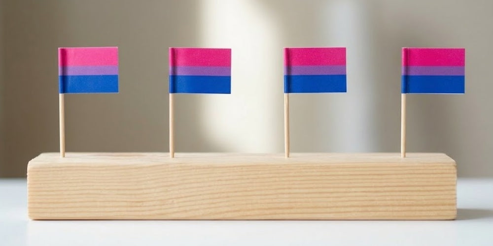
The flag has three horizontal stripes in pink, lavender, and blue. The proportions matter: the pink stripe occupies the top two-fifths of the flag, the blue stripe the bottom two-fifths, and the lavender stripe a narrower band across the centre.
The pink stripe represents attraction to the same gender. It is the wider of the two outer stripes, positioned at the top of the flag.
The blue stripe represents attraction to genders different from your own. It mirrors the pink stripe in width and sits at the base of the flag.
The lavender stripe is the key to the whole design. It represents attraction to both same and different genders: the overlap between pink and blue, literally blending the two colours into one. Page described this as representing the fluid, whole identity that bisexuality is: not a midpoint between two poles, but a distinct orientation with its own character.
The lavender stripe is narrower than the other two by design. It is the meeting point, not the dominant feature. The flag's proportions reflect the idea that bisexuality encompasses both of those broader experiences rather than sitting halfway between them.
The bisexual pride flag was designed by Michael Page in 1998 and unveiled on 5 December of that year. Page was a bisexual activist who had grown frustrated with the lack of visual representation for bi people within the broader LGBTQ+ community. The rainbow flag represented queer people broadly, but bi people had no symbol of their own: no flag that said specifically and unambiguously "this is us."
Page's intention was practical as much as symbolic. He wanted bi people to have a flag they could fly, wear, and use to find each other. The design he created has remained essentially unchanged for over 25 years, which is a quiet measure of how well it served its purpose.
Bisexuality is attraction to people of your own gender and people of other genders. It does not require equal attraction to all genders, it does not require simultaneous attraction, and it does not change based on who you are currently dating or in a relationship with.
The most persistent myths about bisexuality are worth naming directly. Bisexuality is not a phase. It is not confusion. It is not halfway to being gay or straight. A bisexual person in a relationship with someone of a different gender is not "really straight." A bisexual person in a same-gender relationship is not "really gay." Identity does not depend on current circumstance.
Bi people navigate a particular kind of invisibility that is worth understanding. Coming out as bisexual often means coming out repeatedly: to new friends, new colleagues, new partners, new situations. Each time, the same assumptions can resurface. Each time, there may be a need to explain or correct. A bisexual person wearing the flag's colours carries that signal with them without requiring a conversation. It is visible to those who know, and unremarkable to those who do not.
When Page designed the flag in 1998, bi people were largely invisible even within LGBTQ+ spaces. The community had the rainbow flag, but bi people were often treated as temporary visitors: assumed to be gay people not quite ready to commit, or straight people experimenting.
That picture has shifted significantly, but the underlying dynamics have not disappeared. Research consistently shows that bi people face higher rates of anxiety, depression, and social isolation than both gay and straight people, and that a significant part of that is attributed to the specific experience of bi erasure: having your identity dismissed, questioned, or simply not seen.
The flag addresses that erasure directly. It says, without ambiguity, that bisexuality exists as a whole and valid identity. That is not a small thing for a community whose existence has been persistently questioned.
The original 1998 design remains the most widely recognised bisexual flag and the one that appears at Pride events, in community spaces, and on social media globally. A small number of alternative designs have been proposed over the years, but none has achieved meaningful adoption. The Michael Page flag is the bisexual flag, and has been for over 25 years.
The colours do appear in variation across different contexts: lighter or more pastel versions circulate online, and some digital interpretations adjust the saturation. The core palette of pink, lavender, and blue remains consistent and immediately recognisable.
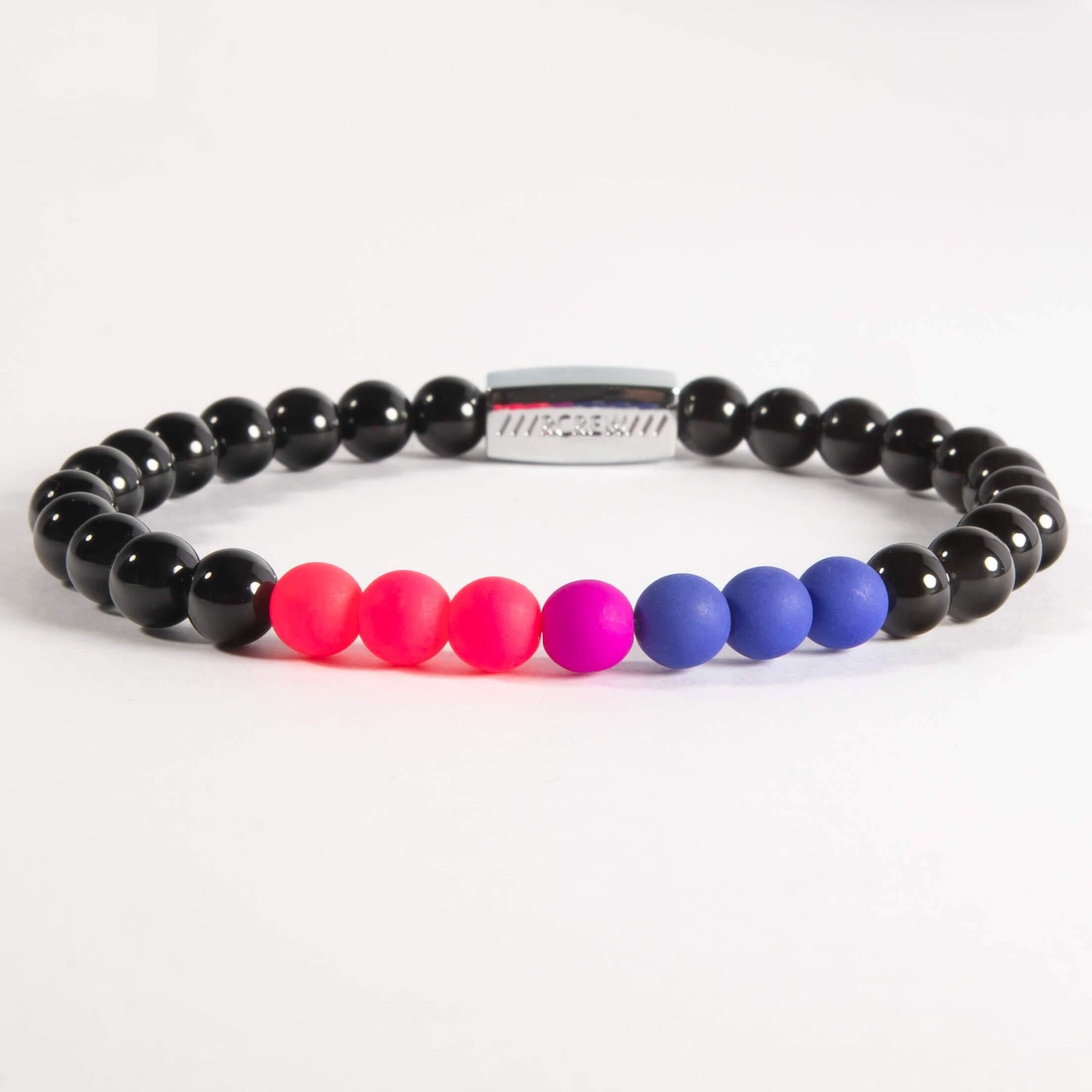
The flag's palette translates well into everyday objects precisely because pink, purple, and blue are not coded as inherently political colours to most people. A bracelet in those colours reads as colourful jewellery to someone unfamiliar with the flag. To someone who knows, it reads as something specific.
That duality is the point. Bi people often navigate a unique kind of visibility: out to some people, not to others, in situations where announcing identity would be unwelcome or unsafe. A wearable signal that works on two levels serves that navigation without requiring a conversation.
The RCREW bold bisexual bracelet translates the flag's pink, purple, and blue into hand-strung beads on a black agate base. To someone who doesn't know the flag, it reads as a colourful beaded bracelet. To someone who does, it says something precise. Made by hand at Watford Workshop in Hertfordshire, a registered charity providing supported employment for people with disabilities.
For a deeper look at what bisexuality means and the broader bi experience, read our guide to bisexuality.
The political and cultural climate in 2026 makes bi visibility more important, not less. As LGBTQ+ rights face renewed pressure in various countries, bi people, already among the most likely to be invisible within their own community, face compounded erasure.
Flying the flag, wearing the colours, and knowing the history is a small but real act of resistance. The bisexual flag has been doing that work since 1998. It is worth knowing what it represents and why it was made.
RCREW bisexual pride bracelets are made by hand at Watford Workshop in Hertfordshire, a registered charity providing supported employment for people with disabilities. Browse the full collection.

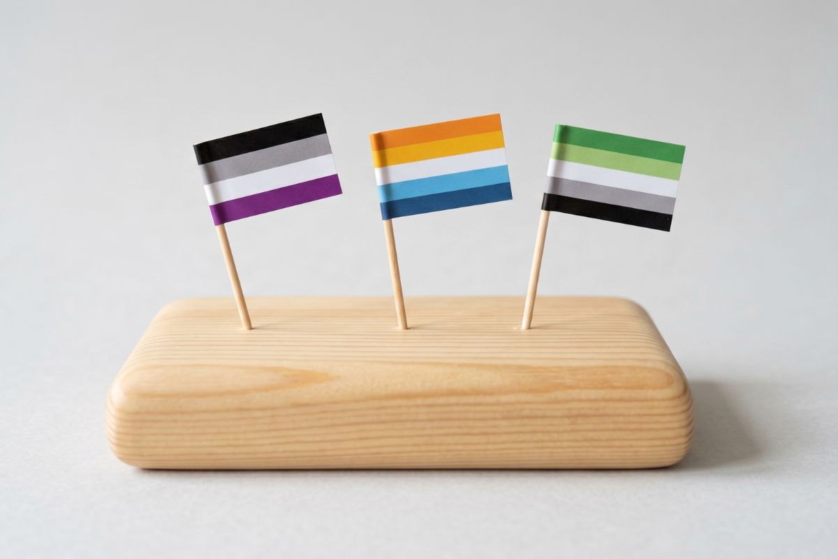
Pride Month is built around love and sexual liberation. For asexual and aromantic people, that framing can make June feel like the loneliest month of all. Here is what that experience actually looks like, and what belonging means when the party was not designed with you in mind.

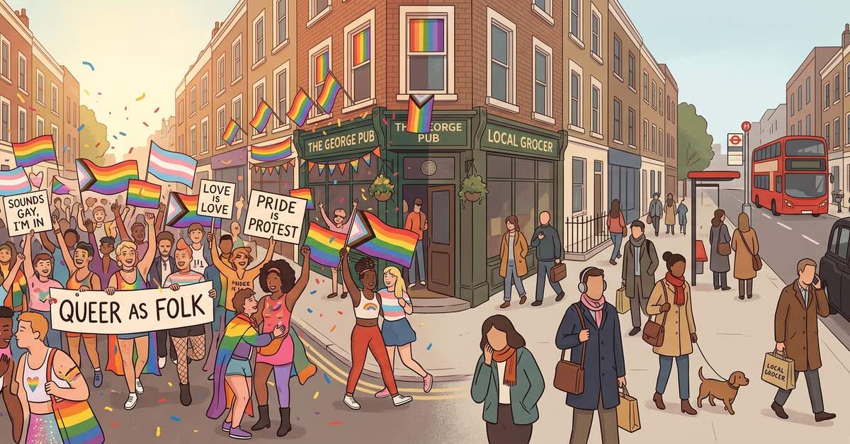
For a few hours every summer, the guesswork stops. You can look around and simply know. This is what Pride does that nothing else does. The question worth asking is what happens when it ends.

You and your people are in the same spaces every day. The same supermarkets, the same offices, the same commutes. The problem was never finding each other. It was knowing each other. And that is a different problem entirely.